Create custom financial and donor reports in Aplos, and showcase your data using sleek charts and graphs. Display your data how you want, and schedule emails of your reports to automatically send to the people who need to see them, such as your board or staff.
Enabling Customer Report Builder in Aplos
Aplos Core is required to enable the Custom Report Builder.
The Custom Report Builder is an add-on feature to your subscription. To enable the feature, navigate to the Subscription page under the Settings section. Select “Change Subscription,” and then add Custom Report Builder. You can also disable Custom Report Builder from this screen.
You must be an Administrator of your Aplos account to change the subscription.
The monthly fee for Custom Report Builder is $75. This is in addition to your regular Aplos subscription.
If your account is in a contract, you can contact us to get access to the Custom Report Builder.
Creating a Custom Report
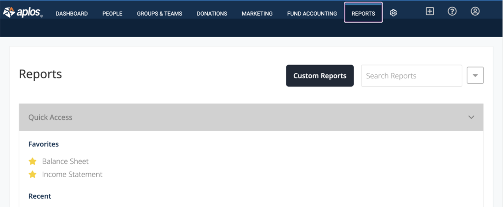
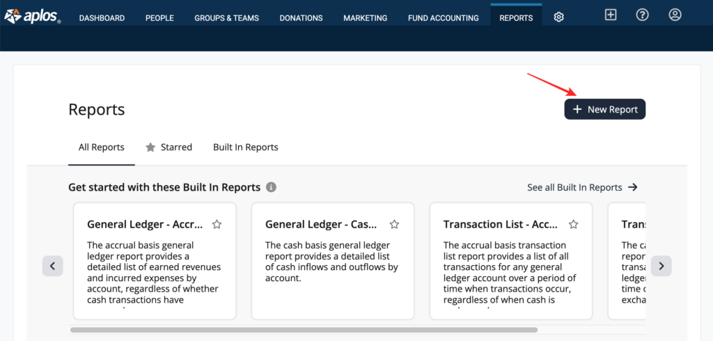
Navigate to the Reports tab in Aplos and click on the Custom Reports button. If you do not see the Custom Reports button, you will need to enable the feature using the instructions above.
From the Custom Report Builder page, you can start with a built-in report or create a new one from your organization’s data.
Using Built-in Reports
Built-in reports are pre-built templated reports that you can use to quickly preview data, or you can modify them to create your own custom reports. These pre-built reports will show columns for data that you would typically see in those reports and then allow you to add additional data to these reports as needed.
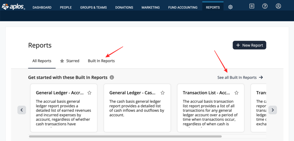
When you land on the Custom Reports page, you will see a preview of some of the built-in reports. You can click on the previews to view those reports.
To view all the built-in reports, click on the Built In Reports tab above the list or click on “See all Built in Reports” on the right side of the page.
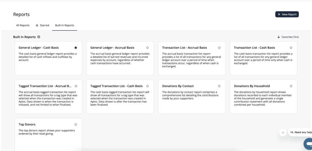
The built-in reports include:
- General Ledger – Accrual Basis
- General Ledger – Cash Basis
- Transaction List – Accrual Basis
- Transaction List – Cash Basis
- Tagged Transaction List (if you have tags enabled) – Accrual Basis
- Tagged Transaction List (if you have tags enabled) – Cash Basis
- Income & Expense – Accrual Basis
- Income & Expense – Cash Basis
- Donations by Contact
- Donations by Household
- Top Donors
- Pledges by Contact
Note: The data powering the Custom Report Builder is updated each morning, so you will see data for the previous day.
Creating New Reports
To create a new report using your organization’s raw data, click “+ New Report.” These reports include all the information that powers the templated reports without filtering out any data.
Select a dataset to preview your data.

Datasets include:
- Movements – Accrual Basis
- Movements – Cash Basis
- Tagged Movements (if you have tags enabled) – Cash Basis
- Tagged Movements (if you have tags enabled) – Accrual Basis
- Donations
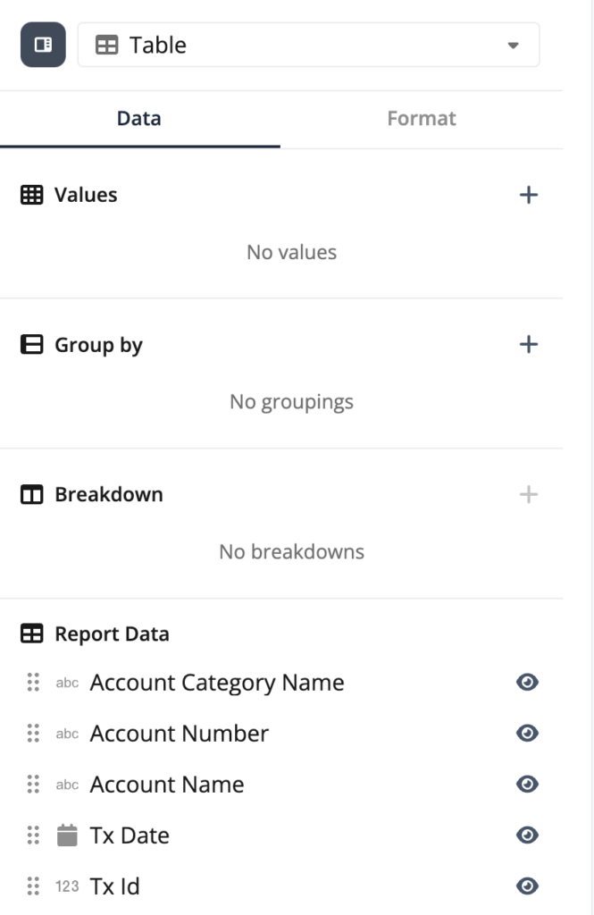
These datasets will show you columns for all the data associated with these datasets. From there, you can hide and rearrange the data into a report that makes sense for you.
Generating Data Views
Another benefit of the Custom Report Builder is the ability to create different visual views of the data, such as a line chart, bar chart, pie graph, or KPI numbers.
To do this, you will first select a templated built-in report or start with a data set to create a report. When viewing the report, you will see an option at the top of the Data Panel on the right-hand side that says “Table.” This is a dropdown that allows you to choose the way you’d like to view the data.
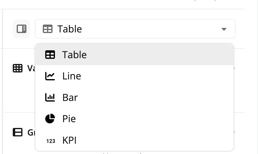
- If you select Line or Bar chart, you will need to choose which parts of the data you would like as your X-Axis and Y-Axis.
- If you select Pie chart, you will need to choose which values you’d like to see and how you would like them grouped.
- If you select KPI, you will need to choose which values you’d like to see.
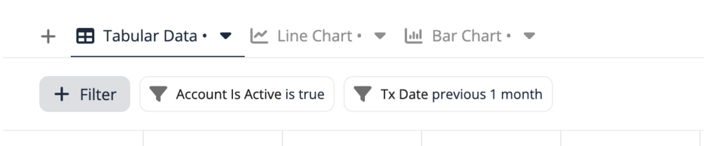
You can also create tabs within a report to view the data in different ways all in one report. Click the plus sign (+) on the left side of the screen to add a tab. Click “+ Filter” on the left side of the screen to add your desired filters.
From the right side of the screen, choose the view you want displayed for each tab (i.e. table, pie chart, etc.), the data fields you wish to include, and the format.
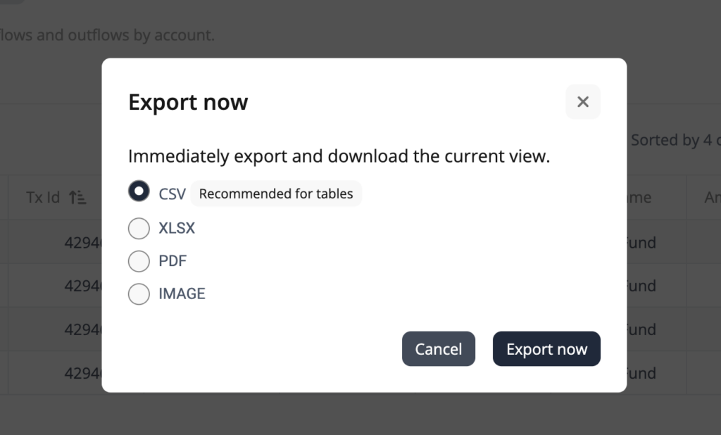
Exporting Reports
In the Custom Report Builder, you also have the ability to export your reports.
You can do this in the following formats:
- CSV (recommended for exporting tables)
- XLSX
- PDF (recommended for exporting graphs)
- IMAGE (recommended for exporting graphs)
You can do this by clicking the Export button on the right-hand side of the screen, and then clicking “Export now.”
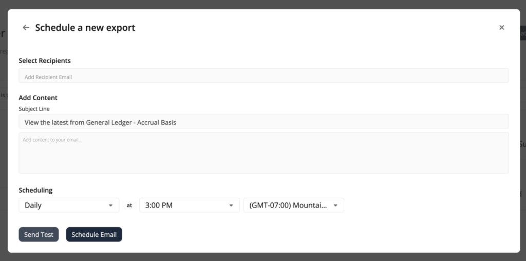
Scheduling Automatic Emails
Using the Export button, you also have the ability to set up automatic emails of the reports you have created. After you click “Export,” click “Schedule Export.”
This is a new feature that is specific to the Custom Report Builder. It will allow you to add the emails of the recipients you want to receive this report, the ability to customize the Subject Line and Email Content, and it will allow you to choose how often you want to send this report, including the time of day and time zone.
Recipients will receive all the different tabs that are included in the report.
Note: Currently, if you email a pie chart, line graph, or bar graph, you will get a CSV file of the data. An update coming soon will also include a PNG of the image.